
When I work with clients to create their new brand identities and logos, I spend a significant amount of time during the project to create their brand identity style guide. While it is a crucial part of the overall brand identity and logo development process, the brand identity style guide is often the most misunderstood and underrated part of the process.
A brand identity style guide itself is just as important as the resulting brand identity and logo, but what exactly is a brand identity style guide, and what do you do with it once you have it?
The brand identity style guide is a guide, or rulebook, that showcases your new brand identity and logo, the colors and typography involved, any special design elements (patterns, textures, etc.), how exactly to use your new brand identity, how not to use your brand identity, and other helpful guidelines when it comes to using your new brand identity and logo that was designed specifically for your organization.
It's essentially your brand identity's playbook. The benefit of a brand identity style guide is to help keep your brand identity's integrity and consistency as you go about using your new brand identity and logo in all of the different environments in which it will live.
Clients hire me to help them develop their brand identities and logos for their business or organization, but often want to start using their new brand identities everywhere they want their logo to be. This is great and is exactly how they should be using their newly created brand identities.
The problem with that, however, is that oftentimes a non-designer is making design decisions relating to where their brand identity and logo will live in different environments. While being a non-designer is not a problem, we don't necessarily want their new brand identity to be misused or live in a not-so-flattering way in the environment in which it sits.
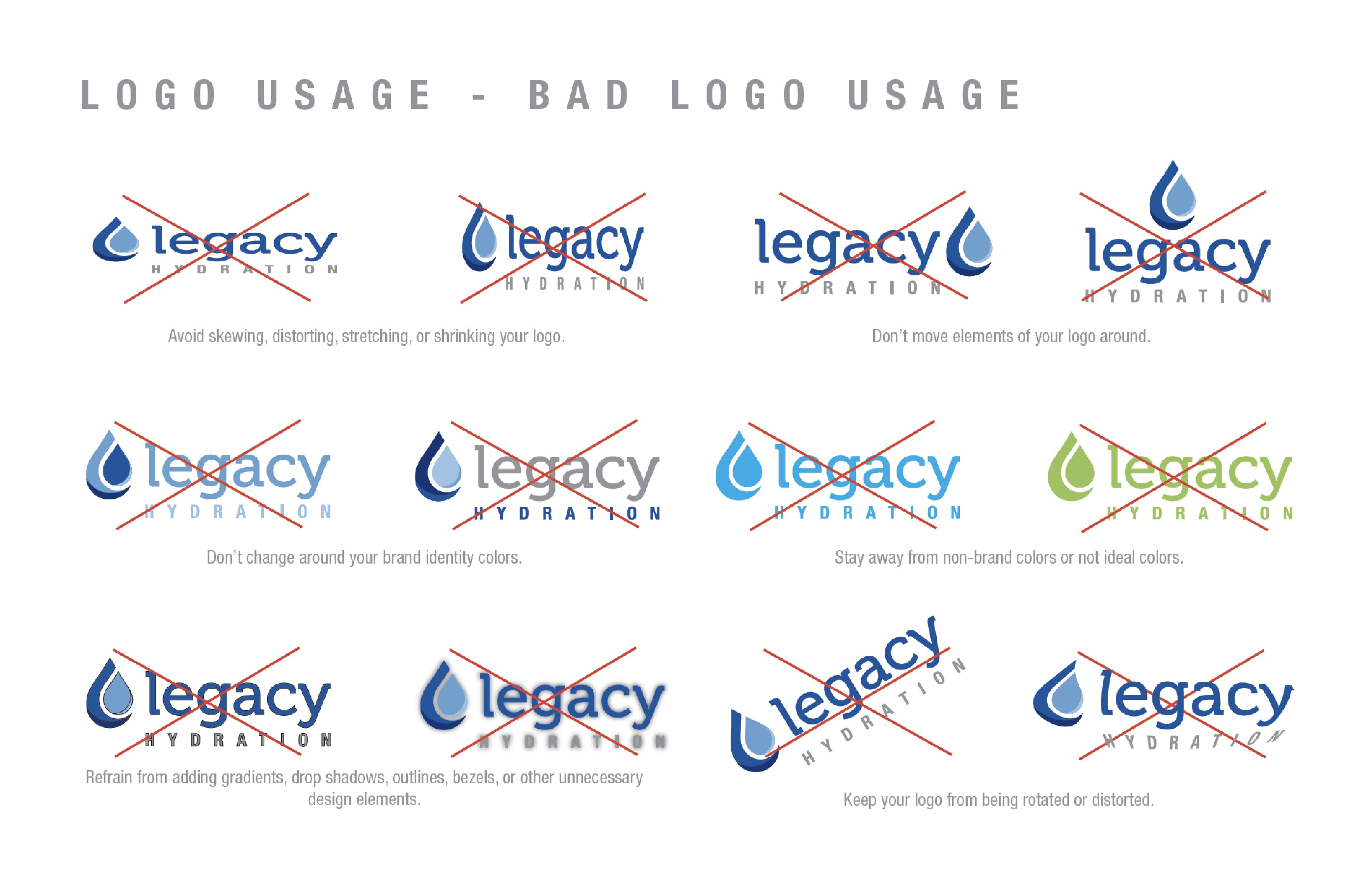
To best explain this, let me provide an example. Let's say you have a great new brand identity and logo that you're super proud of, and can't wait to start putting it everywhere. Without some sort of direction or guidance, it's possible that you could inadvertently put your new brand identity and logo in an environment (like your website, on the side of your car, or in the newspaper) in a way that makes your new logo look absolutely horrible.
You want to put your new logo on your website, and your brand identity colors are navy blue and baby blue, but the area on your website that you want your new logo to sit is a dark gray. If you were to put your new logo in this dark gray area, the navy blue portion of the logo will become very hard to read and also very hard to look at. This puts your logo in a very unflattering light, and drawing attention to it in all the wrong ways.
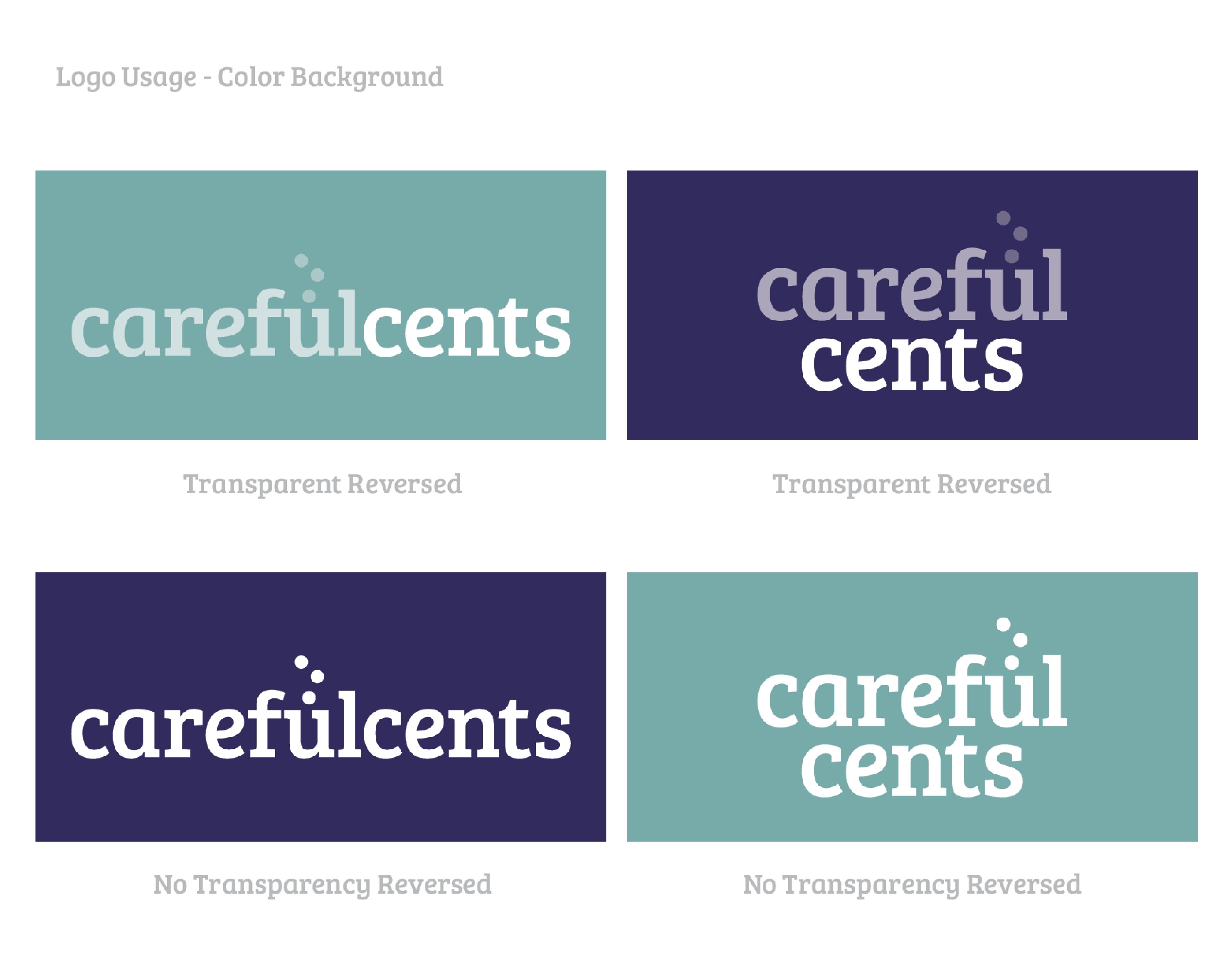
With your new brand identity, you will have gotten several variations of your logo, including your “standard” logo of the navy blue and baby blue, but you would have also gotten versions such as an all-white version and an all-black version. In this particular environment (your website with the dark gray header), the logo that would look the best would be your all-white version.
This is just one example of how you want to make sure your new brand identity and logo are used properly. But, you likely wouldn’t have known this without some trial and error of trying out the logos you were given (or, unless you were a designer).
Having a brand identity style guide would have helped save you time in making this decision. It would have helped you determine exactly what was the best version to use from the start (use the all-white version on dark backgrounds).
The brand identity style guide does much more than making sure your new brand identity and logo are presented well throughout all the environments in which they will live.
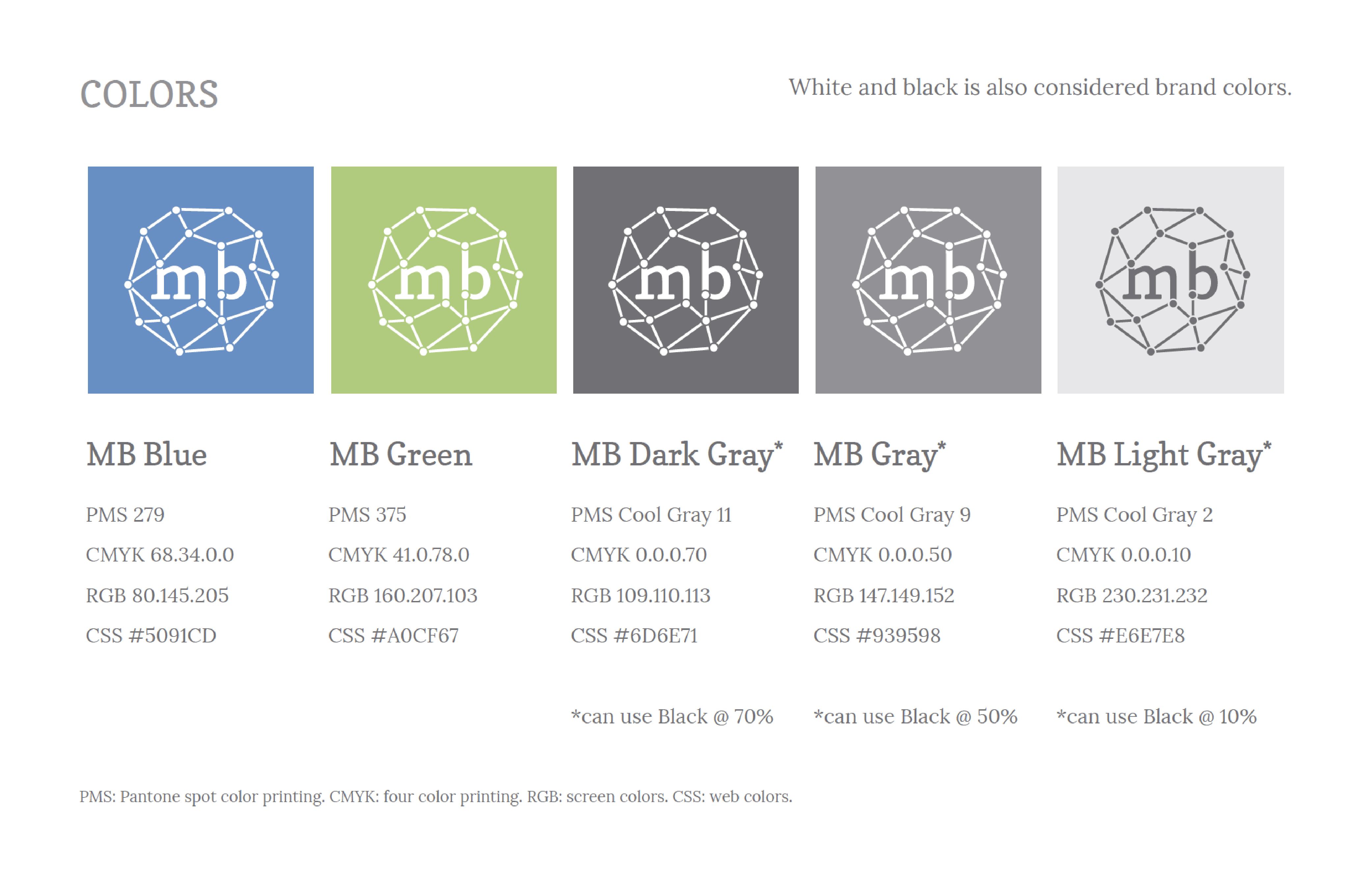
With useful information such as the typography used (including the typeface name), color codes, color combinations, and examples of what not to do all spelled out in the style guide, the brand identity style guide helps guide you through most of the decision-making process when it comes to using your new brand identity and logo.
When you go to print your new brand identity on something, the color codes will come in handy to make sure that the colors stay consistent throughout any type of printing process. Your printer will help make sure the colors come out correctly, instead of guessing at what the colors may be.
When you want to change the typography on your website to match your new brand identity and logo, you now have the name of the typeface and can go through the proper channels to have the typeface served on your website.
These are just a few examples of how useful the brand identity style guide you receive with your new brand identity and logo can be when you start using your new logo in all the different ways you will likely be using it.
Using the brand identity style guide as a rulebook or set of guidelines on how to use your new brand identity and logo helps to keep your overall brand identity and logo as intended and well represented.
Guidelines such as what colors are used, what the typeface is, what other design elements are involved and how to use them, how not to manipulate your logo, and what logo works best in different types of environments can keep you from making poor design decisions and possibly water down your new brand identity.
The purpose of a brand identity is to represent your organization or business in the best light possible. The brand identity style guide helps you do just that with its rules and guidelines. Your brand identity style guide is an asset to your brand identity and helps keep your brand identity consistent, clean, well represented, and overall consistent throughout all of the new environments in which it will live.
Editor's note: All logos and brand identity style guide examples in this article were designed and developed by January Creative LLC.