In our internet-first world, it's common for businesses to want to get their brand identity created, then move straight on to designing their website. Well, I was no exception. As soon as I had the logo and color scheme finalized, it was time to expand the brand identity by getting to work on my website.
For the majority of businesses out there, your website is the most important marketing piece you have at your disposal.
So, significant time is often spent designing and developing the website. It's safe to say that more than half of my time in the last three months were spent on the website wireframe, web design, and web development portion of this rebranding process.
Starting with a wireframe
Before any of my brand identity was used for the web design, I started with a website wireframe to help me visually organize content and check the visual hierarchy of the elements on the page. Wireframes help me organize my content and understand where certain elements need to live on the page and the relationship of those elements to others.
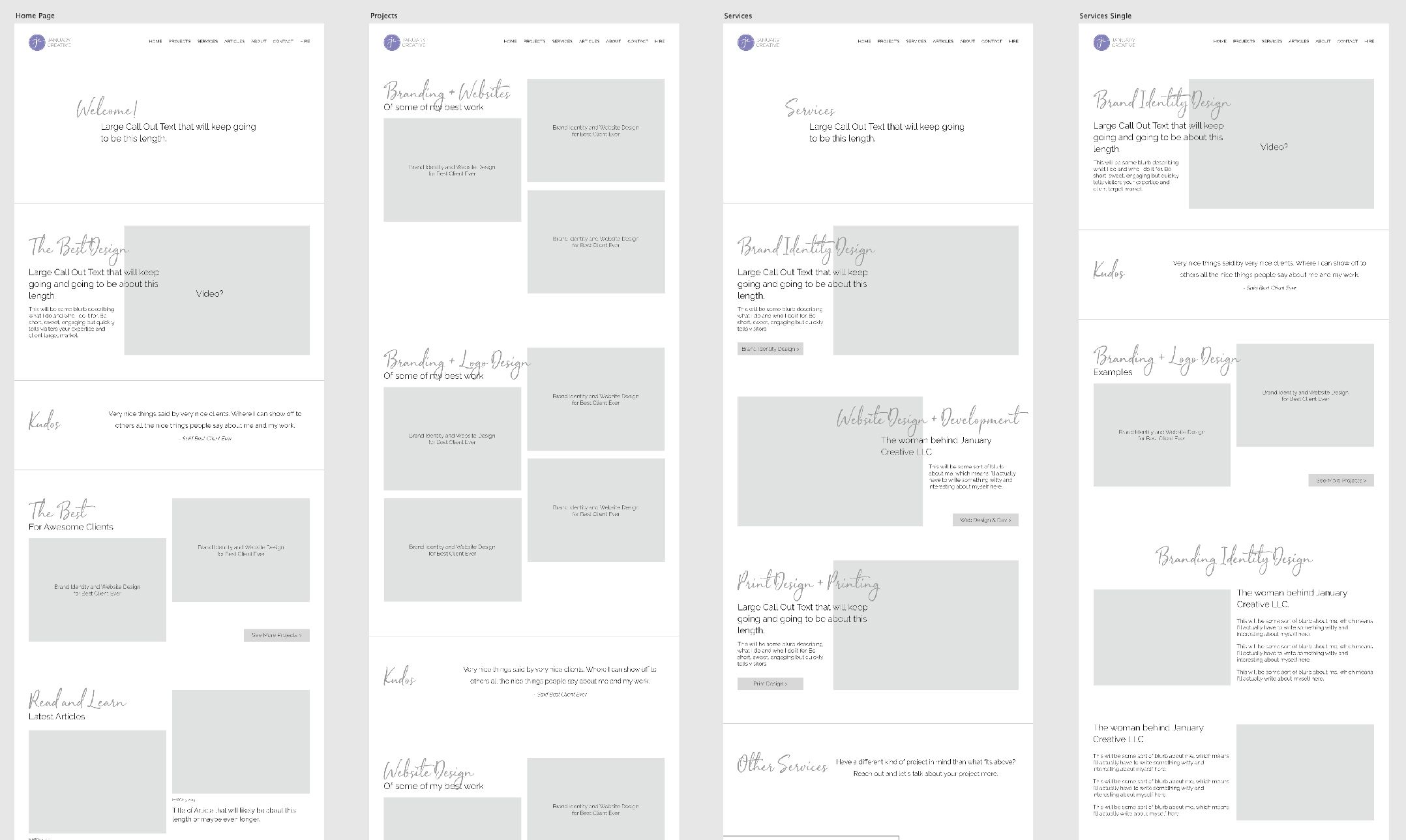
My wireframe was a bit hybrid, however, when compared to traditional wireframes. Traditional website wireframes focus on what content goes where and the general layout of items on the page. While mine also focused on that, I also did some minor experimentation with layouts and doing some minor designing along the way.
Wireframing a website is vitally important because it forces you to focus on the most important elements first, and how those elements work with the next set of important elements, and so on.
As I explained above, it also makes you prioritize those important elements and make sure that the visual hierarchy, or the path that your eyes take down the page, is exactly how you want people to read your page. Without any photos or actual words in place (I tried to use lorem ipsum where possible or dummy text in other areas), you can focus on the path down the page, making sure it aligns with how you want the page to be read.
Creating a sitemap
In addition to the wireframe, I created a sitemap to organize the different types of content I had on the site. This also helped me understand what pages needed to be designed and what content was needed for pages where I may have been lacking content.
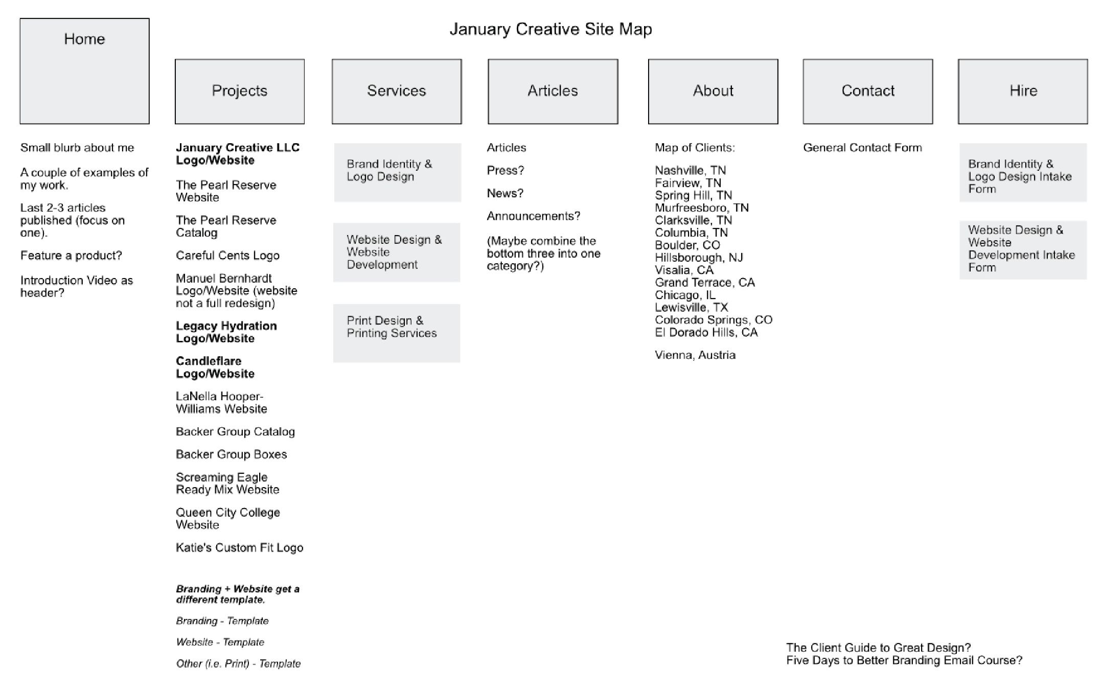
I created this early on in the process. While I was working on the design and other aspects of the site, the sitemap itself changed quite a bit over the course of the project, which is to be expected. During any massive project like this, you learn more things throughout the project, which often leads to changes to your initial plans, hopefully for the better.
This is exactly what happened to my sitemap. I based it off of my current website, but as I started designing the new website, I knew certain things would change, and started changing them during the design phase. This is why the sitemap you see above doesn't perfectly align with what you see on the site today.
Designing the website with my new brand identity
Here's where the fun started! I had my wireframe in place for my website and was pretty satisfied with how my content was laid out and how I wanted it organized. However, for my brand identity, I only had a new logo and color scheme. The rest would need to be figured out during the process.
The overall design aesthetic I was going for was bright, airy, clean, and unique.
With having just a logo and color scheme, the design aesthetic could be endless. But one thing I didn't want to do was start looking like all the other sites on the web, that I knew for sure.
Taking the bright, airy approach, I started working with the brand identity to keep a light and open feel throughout the entire design. This meant lots of white space, no large areas of color or text, light and bright imagery, and only using areas of color sparingly.
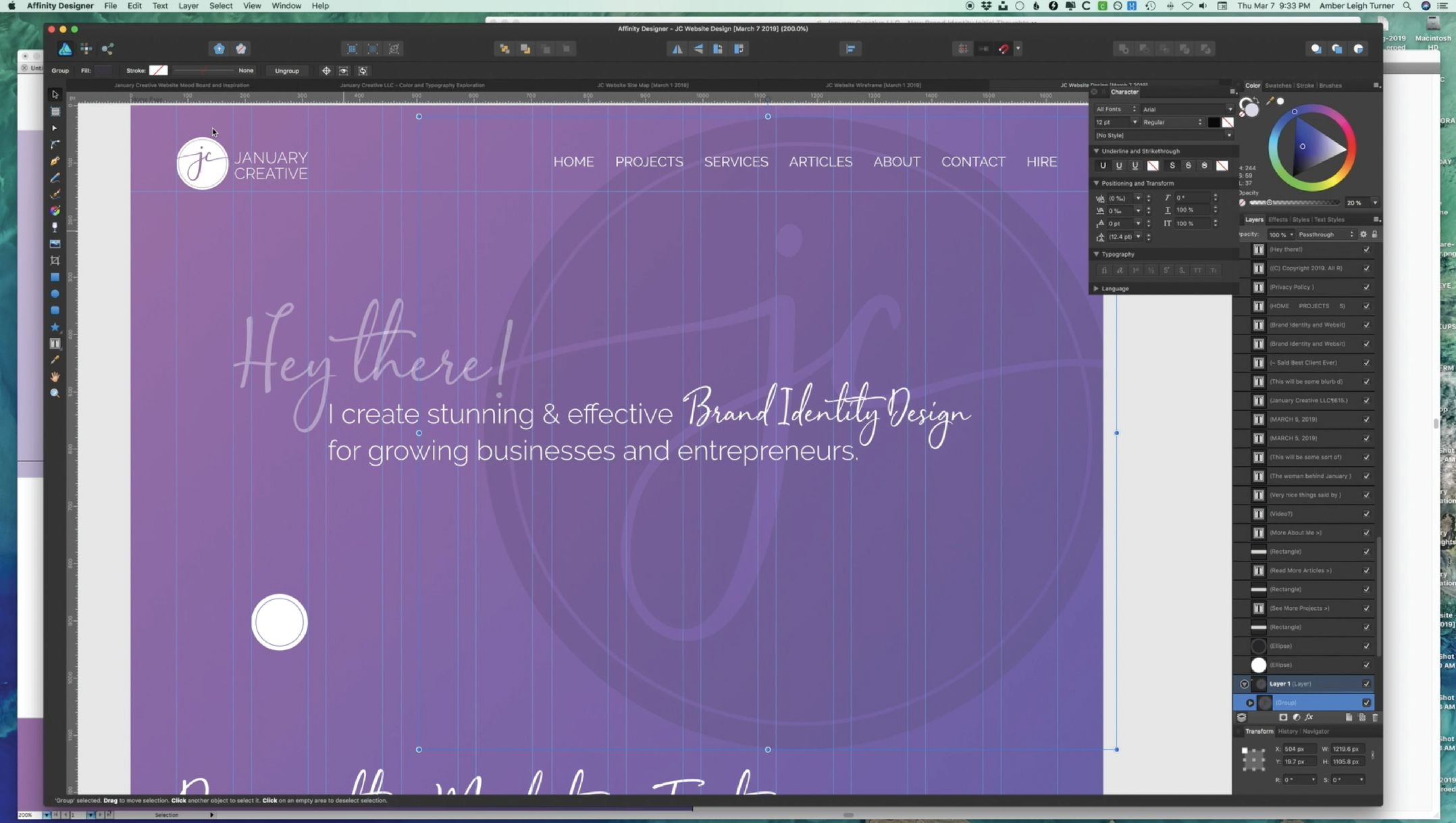
I had to remind myself at times to stay with the design aesthetic I was going for: light, bright, airy, etc. As you can see in the screenshot above, there was a moment where I fell away from that design aesthetic and I had a huge area of color I was working with. I had to keep reminding myself that this wasn't the design aesthetic I was going for, and had to change it.
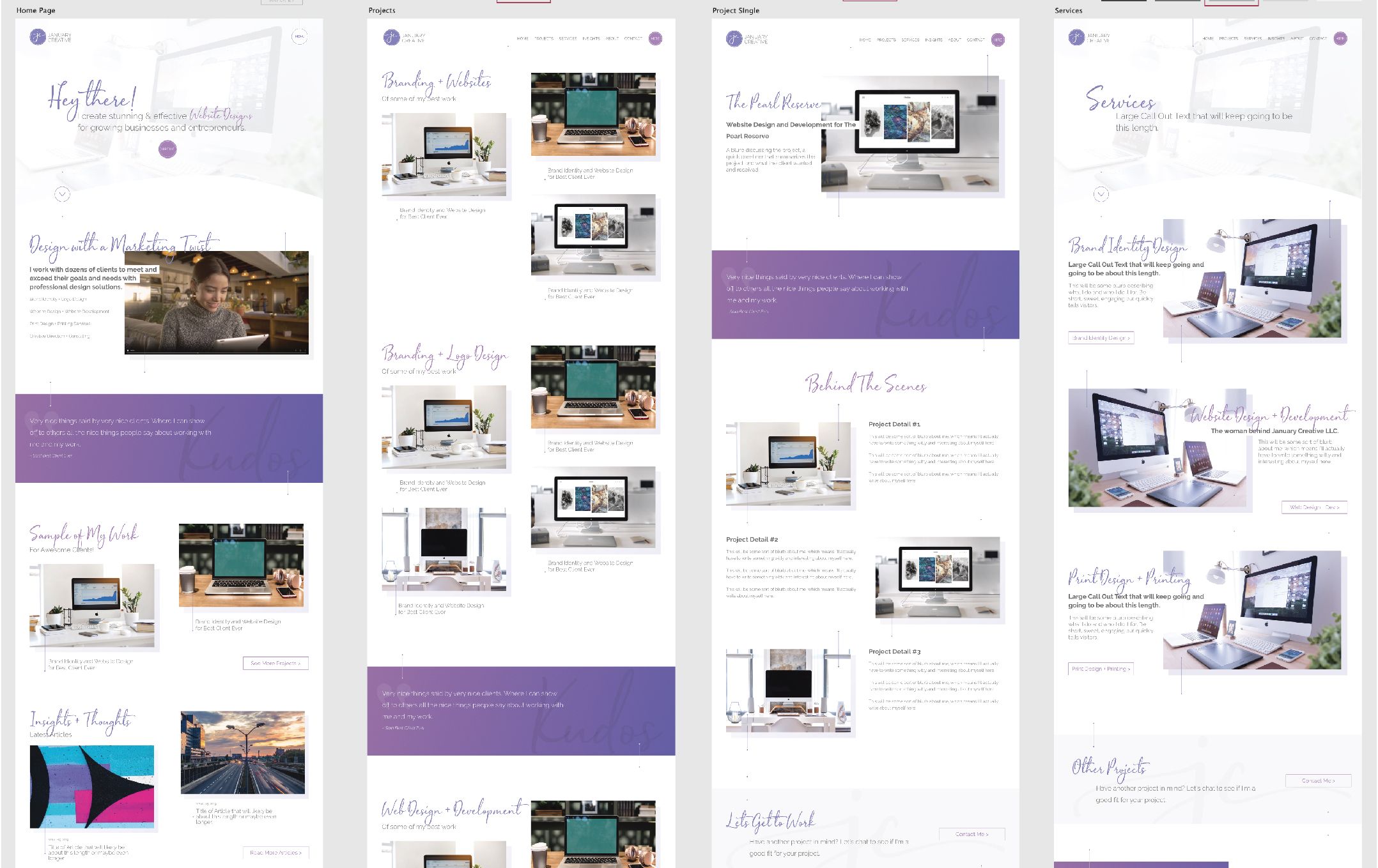
Another part of the design process that needed my focus and creativity was keeping the site from feeling too feminine or too childlike. Purple, while a very creative color, can also feel childlike and girlish. I didn't want my design aesthetic to feel that way either. Keeping a lot of white space helped with this, but also sharp lines also help negate this as well.
While coding the website, a few of these design elements had to change.
For example, text overlaying images weren't working as well as I had initially thought they would. One of the bigger changes from the original design to when the site was coded was the navigation. I decided against having the navigation run along the top right of the screen, but instead now opens up into a full-screen menu. This added substantial development time, however, I feel it works way better this way.
Making the site responsive (which I'll talk about in tomorrow's article) also influenced a few of the design changes that were made as well to make it more friendly for those who wish to visit the site on their phones or tablets. Most of my site traffic comes from people visiting my site on their desktops, so the site was designed for people using desktops, then down to tablets, then to phones.
Experimenting with unique layouts
As you could see some in the wireframe and the resulting design above, I wanted something different than what was being seen on hundreds of websites designed in the last year. One way I accomplished this was to experiment and play with more unexpected layouts, especially layouts that maybe are slightly unconventional for the web.
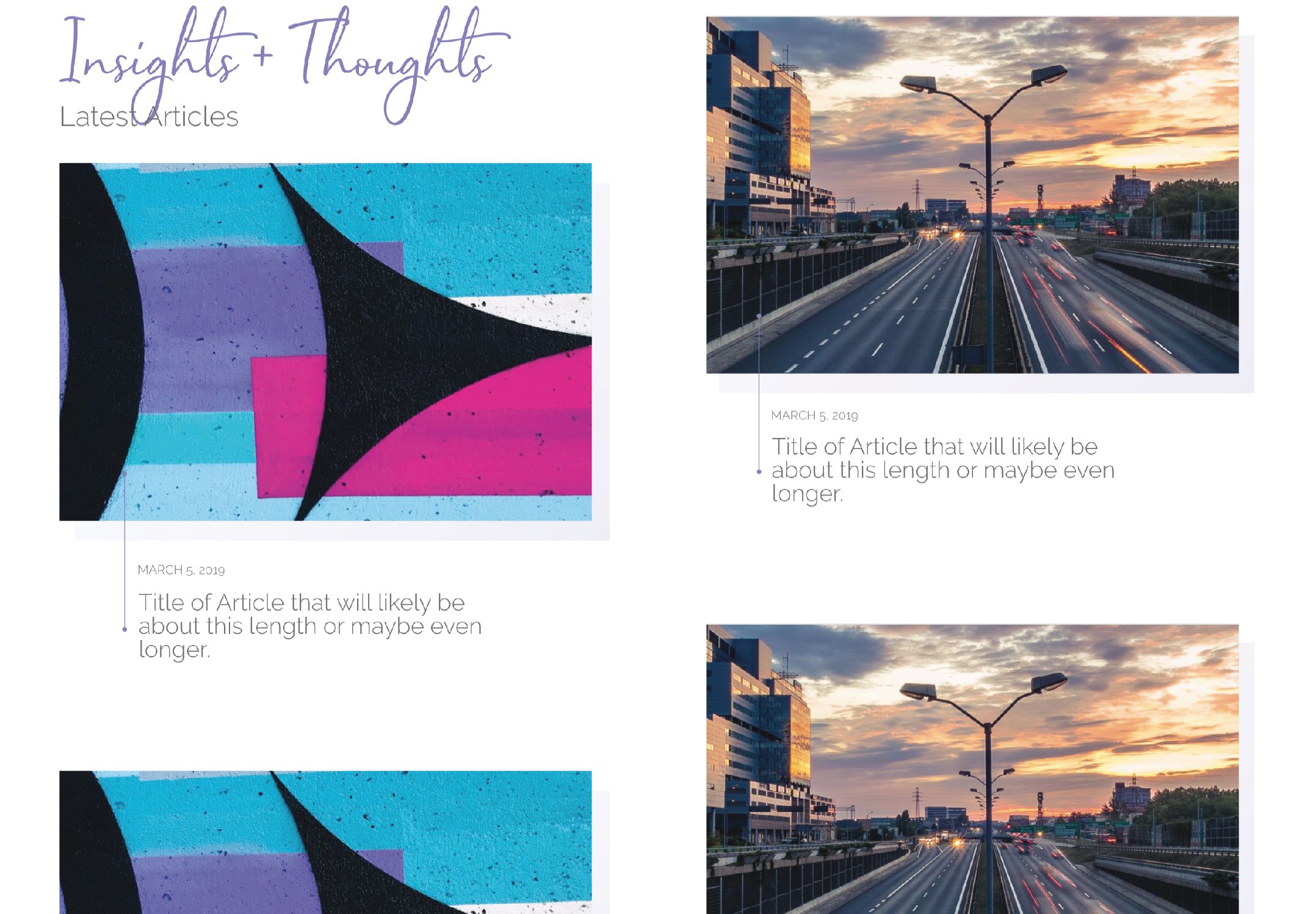
The biggest unique layout I use on my website is my "offset image grid list" that I use (fancy name, huh?). While I can't seem to come up with a fancy name for it, you'll see this list used on my home page, projects page, and my insights page.
The idea here is to grab attention and not be overlooked by creating a layout that is intruging and eye-catching.
We tend to overlook things that seem like we've seen it before, and in this case, having images side by side in a two column layout down the page is old and has been done a thousand times. I wanted to change it up so that it's visually unique and slows someone down to see it. Having the images appear to "break the grid" helps to change things up and presents a couple of unique design points in doing so, such as where you can place the header for the section and any ending buttons.
Another unique layout I experimented with was my footer design. I wanted the footer to be just as well-designed and unique as the rest of the site was, and not appear to be an afterthought. Taking a little inspiration from a few different places online, I decided to do a split footer that included a call-to-action.
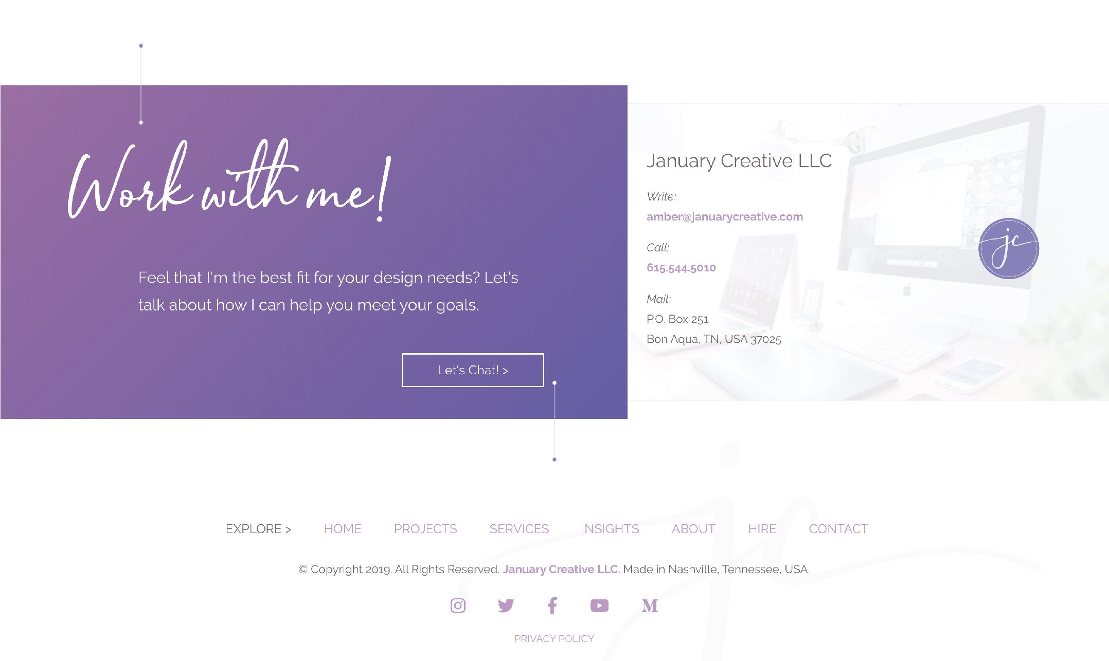
The footer is often one of the most overlooked parts of a website. We all know it's there, but unless we need something in it, we often tend to overlook it. I didn't want that to be the case here. I designed the footer in a way that will demand attention and serve a very important purpose: a call to action to hire me to be your designer.
Now my footer feels like a section of the rest of the site instead of something that is often overlooked. This is mainly accomplished by splitting it nearly in half and not having it run the complete width of the browser viewport.
Adding embellishments for enhancement
I chose to add a few unique embellishments to my design to help bring in even more uniqueness to the design. I don't see this being used much online (or in ways in which I've done so here), so wanted to try something new in terms of design elements that help enhance the page.
These embellishments include both using my signature initial mark and using what I've nicknamed "stitches."
In the image above for the footer, you can see both at use. On the purple area, you can see the lines on the top left and bottom right centered vertically on the lines of the box that move horizontally. These are my "stitches," a name I gave them due to the fact that it looks like a line that comes in and out of the dots on either end, plus they are positioned in a way that it appears they are holding sections of the website on the screen.
Additionally, you can see a faint signature initial mark in the bottom right hand of the white space of the footer, and used in sections such as any light gray call-outs. Matter of fact, did you know I used the signature mark to create the curved part of the bottom of the hero section on the home page (and similar pages)? Clever huh?!?
You will see these stitches and signature initial marks throughout the web design. The stitches are found used in various ways, but often, they are on the purple gradient areas and on the stand-alone images used throughout the site. The signature mark is mainly used in the footer and in lighter color boxes.
The embellishments have now become part of the brand identity and I now use them in places beyond the website.
These embellishments help make the design unique and be tiny little surprises throughout the design. They don't get in the way of any important information, and they help add to the visual flow in some areas (especially in my offset image grid list). Now that they are part of the brand identity, you'll see them beyond this website as well, such as on my videos and especially in my new Instagram grid.
A quick visual history of January Creative's website
The site you see today (May 2019) is considered the third version of January Creative LLC's website. I started January Creative in January 2012 after deciding to move toward full-time self-employment and wanted to give my design studio a solid name and not use my name for it anymore.
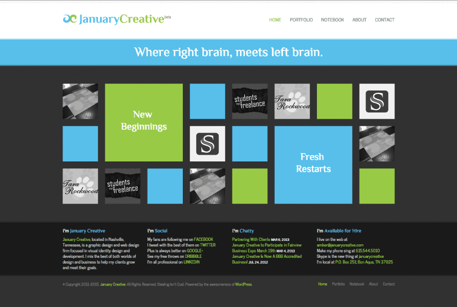
When I opened up in January 2012, the site looked like what you see above, version 1.0 as I affectionally call it. The site heavily favored the Metro style popular back in the day thanks to Microsoft (if you use a modern version of Windows, then this style looks verrrryy familiar you to). Matter of fact, I still get traffic to this day to my site from various references about how my website design was an example of Metro design, even though this site hasn't been live since 2015!

In July 2015, my site desperately needed an update, so after a year of working on it (yes a year - I was in the process of moving during that time), version 2.0 was launched with an entirely new design on top of a brand new content management system. I had previously used WordPress for version 1.0, but this new site was using Statamic 1.0, a flat file, no database, content management system.
Can you believe this website design lasted me five years?!? That's nearly unheard of when it comes to websites, but also shows that the design was able to age well and could still be used today just fine (although, it does kind of look like most sites online today, which isn't a good thing if you're trying to stand out from the crowd).
As you can see, design styles change over time and it's important to make sure your website stays fresh and current.
As embarrassing as it is to relive my old website designs, it's important to show the history of this site as well, to show just how far I've become as a designer and how far January Creative has come as well. All businesses change over time and making sure you stay up-to-date on your website to reflect your changes is crucial and is the main reason I started this entire rebranding process to begin with.
Time-lapse video of the web design process
Just like in my previous articles, I screen recorded every step in the website wireframe and web design process and combined it all together in this time-lapse video.
I'm taking you behind the scenes and show you the time-lapsed version of the website wireframe and web design process that it took to rebrand my design firm January Creative LLC. The video below has an introduction followed by the time-lapse. Feel free to speed it up or slow it down using the function in the bottom right-hand corner to make the time-lapse faster or slower depending on what you want to see.
The website wireframe and web design process you see above took roughly 12 hours. You'll notice that parts of the current web design look different than what you see in the screenshots and video above. As the website was coded, some of the design elements were changed and made better as the process went along.
Tomorrow, I'll continue to show you the behind the scenes and show you the web development process for January Creative LLC's new website, including seeing all the coding and working with my content management system of choice!