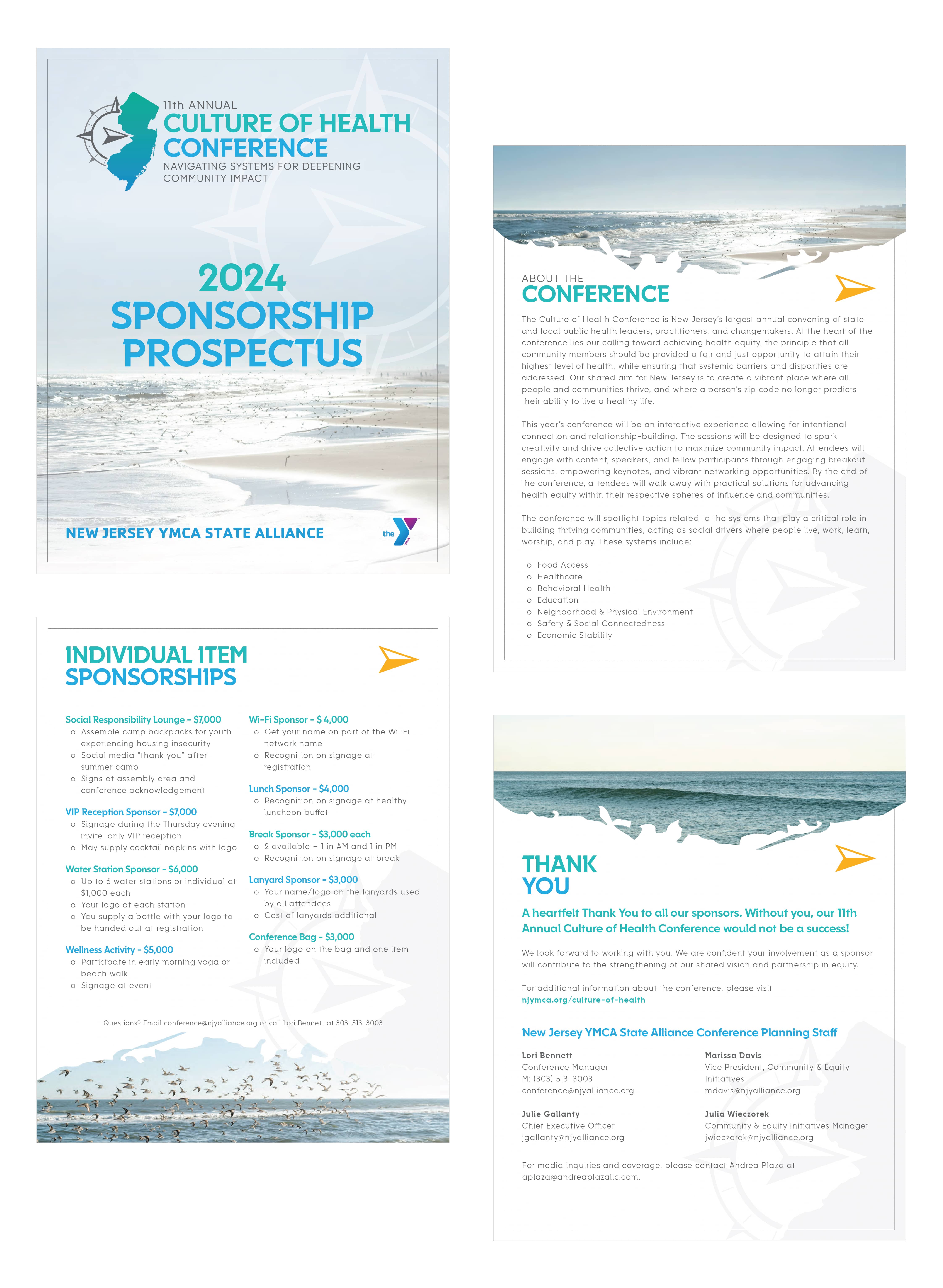
11th Annual Culture of Health Conference
Conference Brand Identity Design + Logo Design + Marketing Design
The New Jersey YMCA State Alliance was looking to revamp their annual Culture of Health Conference. Having worked with them for several years on various design and marketing needs, they reached out to me to create a brand new brand identity and all of their marketing design needs for their Culture of Health Conference for 2024, in its 11th year.