Menu Close Menu

DDT Concrete

Brand Identity + Website

Mike Wallace was looking for a new, updated, professional look for his concrete company DDT Concrete. Being in the business for over 25 years, he's been expanding rapidly into new service areas and wanted to create a better first impressions for customers that were looking to hire him. He wasn't happy with his current website and logo, and wanted to completely redo it so that it would impress prospective customers and help him land more projects.

Project Details

Professional, dependable, experienced

In talking with Mike, some of the main things he wanted was to show how experienced he was at the work he does. He's been operating his business for 25 years and wanted that to reflect in his new logo. His main focus was for when prospective clients see his website, or his truck with his logo on it, he wanted to convey his experience and professionalism.

So, I got to work creating for him a logo and brand identity that would convey those exact brand drivers: professional, dependable, experienced. Mike gave me near complete design freedom and liberty to do what I felt was best for his business, so I worked with a few different design styles and color schemes before narrowing it down to these two options for Mike.

Making the logo final

When I showed Mike those two concepts (above), he liked the direction but wanted a few minor changes. He liked the gold and gray color scheme, but felt something was still missing. After talking with him a bit, we opted to try a few different diamond shapes for the logo.

Why a diamond shape? Turns out the abbreviation "DDT" stood for "Diamond Deluxe Touch," a phrase he used in the early part of his business that he seldom uses now but still holds value to him. After hearing this, I knew I needed edit the logo concept to include a diamond shape.

If you ask me, I feel like the diamond shape of the new logo greatly improved the overall logo design. I presented Mike with these two different options (right) for the diamond version of his logo, a distressed version (left) and a solid version (right). He was especially pleased with this version and was very excited to move forward with this concept.

Developing his brand identity style guide

Once we finalized Mike's new logo, it was time to work on his brand identity style guide. His brand identity style guide would help him understand his brand identity and logo better, and know exactly how to use it going forward. One of the main parts of his brand identity design guide is the color scheme. In this part of his brand identity style guide, I outlined for him the specific color codes he would need for just about any type of usage he may find himself in.

Here, you can see his official colors and color codes, codes that are especially important for things such as printing (Pantone and CMYK), screen (RGB), and web (CSS). Depending on where Mike would be using his logo, these color codes will come in handy to the professionals working with his logo to make sure that his colors stay true, such as using just the right hue of gold where it isn't too yellow or too orange.

Providing various options for logo usage

A strong brand identity comes with a variety of ways in which to use a logo properly. Since many of my clients are not designers themselves, I help them through the process of knowing how to use their logos in any future needs they may have. This is no different for Mike. I wanted him to know how he can use his logo in different environments and which logo would be best suited for those environments.

This part of his brand identity style guide not only outlines all of the various proper logo design variations and where to use them, it also indicates all of the different logo variations that I gave to him for immediate use. Instead of him going through the process of having to change the logo for each usage, I saved him hours of time and hundreds of dollars by providing all of these vector logo variations as part of his brand identity design package. He has every file he ever needs for his logo, including all the variations and both vector and web formats.

How not to treat a logo

Not only did I want Mike to know exactly how to use his new logo in a variety of different environments, I also wanted to outline bad ways to use his logo, or the ways in which could make his logo look less than ideal. I feel this is an important part of the brand identity design process. So much time and effort has gone into creating the perfect brand identity for my clients, so I want them to understand both how to and how not to use their logo moving forward.

Since giving visuals is always the best teaching tool, I provided a variety of ways for clients to understand how not to use their logo, such as not to stretch or skew their logo, not change the colors around, or otherwise do things to their logo that could make their logo look less than ideal. A strong brand identity can only stay strong by keeping the logo as intended in the variety of uses that it will be serving. This page, along with the rest of the brand identity design style guide, will help Mike understand and know exactly how to use his new logo in all of the ways he'll be using it throughout his business for many years to come.

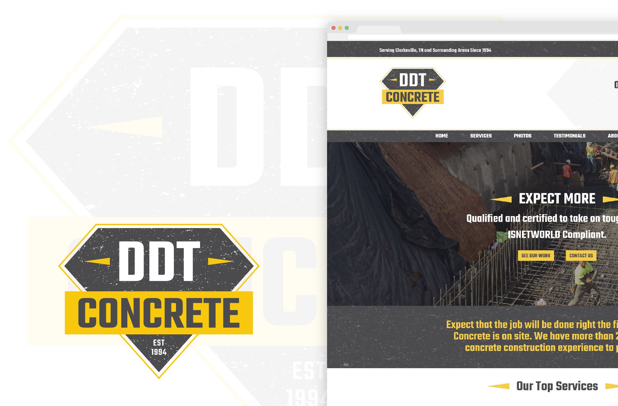
Designing a new website to match his new brand identity

With Mike's new brand identity complete, it was time to revamp his old website using the brand new brand identity I created for him. He was absolutely not a fan of his existing website, and even admitted that he felt it was costing him valuable business (this wasn't just a hunch either, he actually had prospective clients tell him this!).

Since the majority of his prospective clients are likely going to find out about him online or through word of mouth (then go to his website), the most important thing to Mike was to make sure he had an impressive website that he was proud of and eager to share to prospective clients, but most importantly, wouldn't scare them away either.

His previous website was dated, tired, not very user-friendly, and wasn't mobile ready. These were the main things that Mike wanted addressed with his new website. The number one thing he wanted his new website to do was showcase his work. With 25 years of experience, he wanted to make sure that prospective customers knew he was experienced, knowledgeable, and able to tackle any type of job small and large. Photos was the most important way to convey this.

Mike's new website puts his work front and center, showcasing photos of his work and the types of services that he offers. In addition to showcasing dozens of photos, his website also includes up to date information about the services that he offers and information about himself. Finally, he now also has testimonials featured on his website from previous clients, and a way new clients can contact him directly.

You can check out Mike's new website here: ddtconcrete.com
With a brand new brand identity, logo, and website, it's no question that Mike is set up properly to continue growing his business, of which he's been working on drastically increasing his services to bigger and better clients. His new brand identity and website will help him do just that while also being something he's proud and eager to share.